Ámonos
Refresh and redesign the Bellevue, WA. Ámonos Mexican Kitchen logo identity and branding.
CLIENT — Student Work
MY ROLE — Art Direction, Branding, Graphic Design, Drawing, Calligraphy/Lettering

Ámonos, a taco truck, expanded from a sole stationary taco truck to adding a mobile food truck to their business. Ámonos wished for bright, fun colors. Knowing their food is above their competitors, they wished for their brand to stand out and be recognized as well.

Ámonos is a play on the Spanish word, vámonos, which means, let’s go. As the business was adding a traveling food truck to their fleet, I sensed a design of motion, consequently the emblematic circle began. The shape is also derived from the tires on a food truck. In addition, its inspiration comes from the shape of a tortilla.

As Ámonos prides itself for authentic Mexican cuisine, I wanted the identity to feature a system of hand drawn and handwritten elements with a personal and playful touch using my own calligraphy skills and knowledge to communicate an authentic feel.

Part of the logomark, a common and recognizable ingredient in Mexican cuisine and an ingredient Ámonos uses, the red chili pepper. I didn’t care for an obvious appearance, but a mark that’s part of the design, and if observed closely, bear resemblence to a red chili pepper.

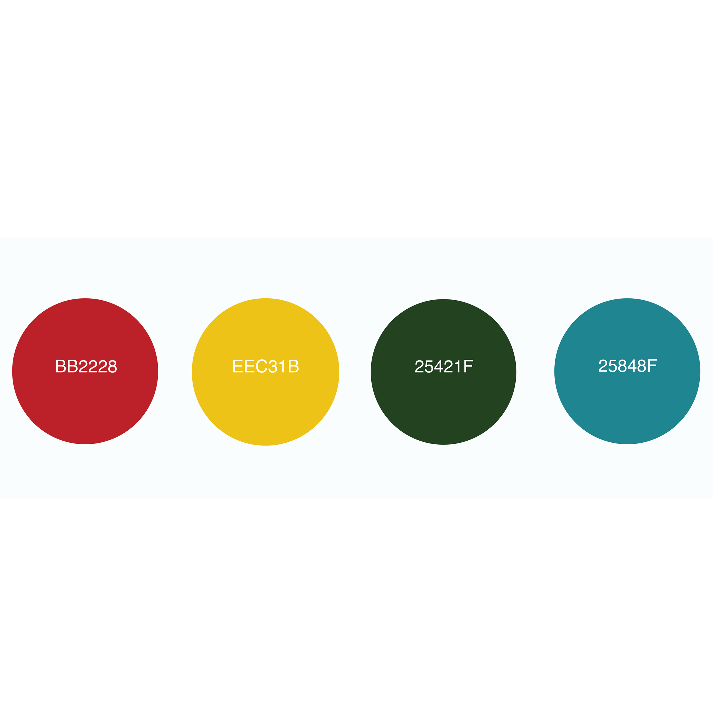
The colors were inspired contemplating the colors of the Mexican flag. Turquoise, though just a small part of the Mexican flag, is very distinct, visible and unique and seemed a perfect choice for the main background color. Associated with feelings of friendship, tranquility, whole and fresh it also looked to be the ideal choice.

A chronic napkin doodler and brainstormer.
Are you too?


